Showing posts with label Sally Hansen. Show all posts

Wednesday, May 11, 2011

Sally Hansen: Love in Bloom

Well this polish didn't turn out at all the way I expected. This was 5 coats, and as you can see it was no where close to being opaque. But I'm kind of okay with that. It is a nice layering polish, and it has a really nice and unique finish. It seems almost like a foil, but clearly not metallic. It has little tiny flakes of shimmer in it, but it is very muted shimmer. Just a hint of reflection, really.  Hopefully enlarging the images will help to explain them better. 


Tuesday, March 29, 2011

Sally Hansen: Silver Lining

Today I wanted to show you guys a nice summery color, so I went with Sally Hansen Silver Lining from the collection last year that had Hidden Treasure. This polish is pretty sheer (along with practically every other polish from that collection). This was 5 or 6 coats... But worth it, I think. It has a clear base, and it is mostly made up of silver glitter - but there is the occasional hint of blue/green/teal glitter that makes it special. 


Saturday, March 5, 2011

Sally Hansen: Coral Amber

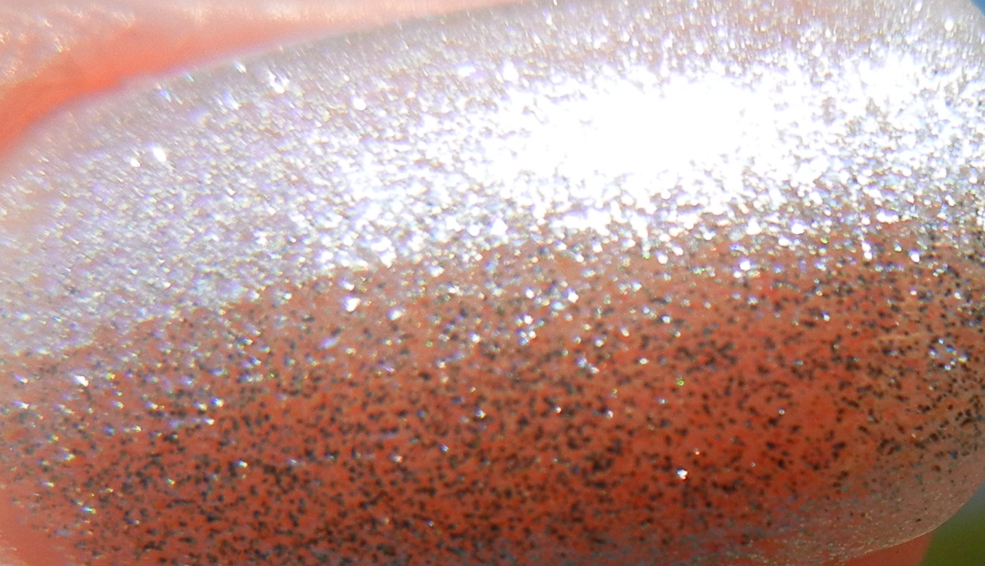
I got this polish after seeing tons of gorgeous pictures of Sally Hansen Prisms all of the internet. And I checked ebay to see if they had any.. and they certainly did. I found someone selling a lot of 10 polishes for like 20 bucks. So.. I jumped at it. This was the polish I was most excited about - a gorgeous duochrome that is mostly orange but in the bottle has a huge golden flash. Well - unfortunately it doesn't play out that way on the nail. It just looks like regular old orange. A very pretty orange - but plain old orange nonetheless. So this polish was a huge letdown. Hopefully the others will be better. 

Oh and also, this polish was extremely sheer. I suppose these were meant for layering. This was 5 coats. 


Sunday, January 16, 2011

Sally Hansen: Lightening

I like yellow. It is such a cheery color. I don't think it looks that good on me - but I love it anyway. This yellow polish isn't bad, but it isn't great either. But it is widely available at every Walmart, Target, Walgreens, CVS, and any other store you can think of - so that's a plus. Sally Hansen Lightening from the Insta-Dri line. I usually like the colors from the Insta-Dri line and don't like the formula. And that holds true for this polish as well. It is really opaque, which is good. But it is also very thick and streaky, so it requires numerous coats regardless of the fact that it is pretty opaque. I don't know about you guys, but if I'm going to do numerous coats, I want them to be thin. Because what happens with me when I wear the Insta-Dri polishes is that the final product ends up being so thick it takes foreverrrrr to dry. And then I bump my hands into things and dent my polish and then I just end up taking it off. Which is exactly what happened to me when I wore this. But if you are willing to deal with all of that, it really is a nice color yellow. 


Friday, October 22, 2010

Sally Hansen: Going Grape

Here is a polish that normally I would be madly in love with. But unfortunately I hate it!! I don't have issues with the color. The color is gorgeoussss. But the formula fucking blows. I usually like Insta-Dri's. But this was a goopy, runny mess. This was the 3rd attempt at applying this polish. The other attempts ended with splotchy polish and globs hanging off of some nails. 


The application for this attempt wasn't too bad, but that's because I thinned the polish out with Seche Restore. I really don't think I should have to thin out a brand new polish. But oh well. 


I do love the duochrominess. And the shimmer. And I just think the shade of purple is gorgeous. Though I definitely won't be reaching for this polish in a pinch. 


And in the shade: 


Thursday, October 21, 2010

Sally Hansen: Lagoon

Well this is the polish that prompted me to try out the Sally Hansen Complete Salon Manicure Line. Because quite frankly, the core line that they originally came out with was pretty god damned ugly (with the exception of Commander in Chic). So anyhoo, when I saw the spring line inspired by beaches and mermaids and all sorts of pretty tropically things, I knew I was going to have to cave and try them out. 

So this was originally the only color that I wanted. It just seemed so fabulous on all the other bloggers sites. unfortunately, I'm really not a fan. Which is a shocker if you know me, because I'm usually all overrrr anything that is blue/green/sparkly/and shimmery. But I suppose my expectations were just too high.


In the polish's defense, these pictures don't really do it justice. They seem really washed out. Bizarre. The polish is a slightly darker teal in real life, with a hint of yellow/golden shimmer. The pictures on Vampy Varnish are more true what the polish actually looks like, at least color wise. For some reason this just didn't really work with my skin I guess, because it just seems blah to me. 

Wednesday, October 20, 2010

Sally Hansen: Sequin Scandal


When I was at Ulta grabbing some Bare Minerals (the best makeup in the world) I saw the new Sally Hansen Complete Salon Manicure Fall 2010 display. So I grabbed the only one that really stood out to me, Sequin Scandal. I love this polish! Though I really wish it looked more like the bottle. But it is still pretty awesome. Very dark and mysterious. It looks like an extremely dark olive green or black base with lotssss and lots of golden shimmer. 


See how pretty the bottle looks??!! I just wish it was a little lighter. 


Saturday, October 16, 2010

Sally Hansen: Brisk Blue

Hey, here's a pretty nifty polish I recently picked up. I was hesitant to grab this polish when it first came out over the spring/summer because I already own a plethora of bright blues, but I'm really glad I picked this one up at Target. It is just so cheerful! I've been in a fall mood lately and have been wearing a lot of dark colors, so this was a refreshing change. And since it was over 90 degrees here the other day, totally applicable.


Just a warning, I'm not sure if it was this or the polish I swatched right after I took this off, but I had smurf hands for hours. I soaked my hands in lemon juice and they were stilllll blue. Very blue. So be careful. Use lots of base coats. And try not to rub the cotton ball/whatever you use to take off polish all over your fingers. Stick to soaking your cotton with lots of nail polish remover and letting it sit for a few seconds on the nail and then swiping downward so that you don't have the same issue I did. 

Monday, September 13, 2010

Sally Hansen: Sea and Be Seen

Alright... so this is the reason why I had such high expectations for Blue Island Iced Tea...


Wow! That's a really shitty picture. 


Okay that's a little bit better but it's still not great. Anyhoo - so this is a gorgeous periwinkle shimmer from the Complete Salon Manicure collection. I love it. My only complaint is that it is way too sheer. This is like 5 coats. I'm not sure if the polishes from this collection were all intended to be layering polishes to go on top of other stuff, but I really wish they would be thicker. This and Silver Lining and Dive Deeper... they all need 4-5 coats. I do have another polish from the collection that only needs 3, but I like my polish to be as opaque as possible. But the colors from this collection make it worth it. 


For some reason I am not a fan of these pictures. Oh well.. I'll take more the next time I wear it. I really only swatched it to compare to Blue Island Iced Tea. 

I love the purple and blue shimmer. To me it just seems to have such a effervescent quality. I just feel like I should be swimming and hanging out at the beach when I wear this. Which reminds me BD, we need to go to the beach. Because you're my only beach friend and before we know it the summer is going to be gone in a couple of months.